Umar Khan
I’m here in Lahore, but my brain’s probably in the middle of its next product pitch.
I'm a skilled people manager and product manager. With years of experience leading cross-functional teams to scale, I am passionate about helping others improve their products and achieve their professional goals.
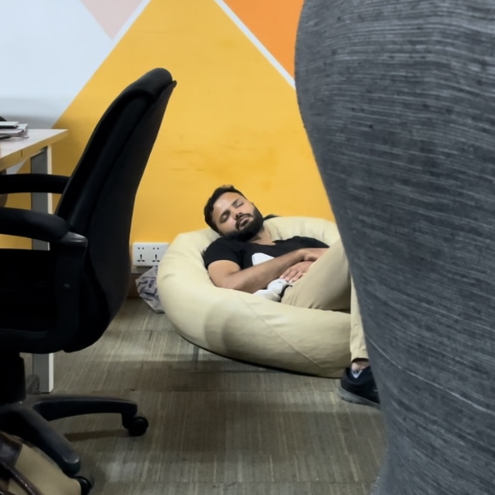
... and sometimes I fell asleep while working
Here is the short story about me:
So, after I wrapped up my degree in Management & Technology, I jumped headfirst into the world of product management. I’ve had the chance to work with three SaaS startups, and let me tell you, it’s been a wild ride!


SocialBu
As a product manager at SocialBu.com, I successfully completed multiple product cycles, overseeing everything from initial concept pitches to final delivery. My focus on user feedback and agile methodologies ensured that we consistently delivered high-quality features that met our users’ needs.
ChatFai (got acquired)
In July 2025, I successfully led the acquisition of ChatFai.com. Before that, I was leadig product management team. Plus, I dove into Reddit to boost our organic growth, and it’s really paid off.
LinkMngr
Think of a mini web page just for sharing links! I worked on the bio pages feature for LinkMngr.com, which let users pick from different styles to stand out online.